The KISS in Design
Biodegradable and compostable packaging is becoming more and more popular. However, the materials available are still very limited, therefore the label finishing options are also limited.
This means that the design of the label is even more important than ever.
Many of our customers, from all kinds of industries, have already chosen biodegradable stickers to promote their products and services. As with any label, the design and content is key but also is the message it gives. These companies are choosing a more eco-friendly form of packaging which reflects their companies values and ethos.
How can this be reflected in the design of a biodegradable sticker?
the natural look
Statistics show that a third of consumers choose to purchase goods from brands that support a positive social and environmental image. Many well known brands are adopting a natural design in their labels which captures a more eco-friendly look.
give it a twist
Of course, you also don’t want your label to get lost in a sea of soft browns, greens and blues, so lacing the design with more striking colours as a secondary accent can give an eye catching element to help the label stand out, without sacrificing that natural effect.
the material
Many of our biodegradable and compostable papers already give a more natural feel simply because of the material used, such as sugar cane and hemp. If you want your label to have a different effect, this is also possible by printing on biodegradable craft paper for example, or a clear biodegradable material.
Whatever the material you choose, you need to keep in mind that, although the paper maybe biodegradable, the ink used may not be. Therefore, the less ink used, the more the sticker is biodegradable. Hence why, a simply design, not only gives an eco-friendly message, it is also better for the environment!
the font
Give the font type you choose a lot of thought and also, only use a maximum of two fonts to make sure the label is easy to read. Of course, if you have already branded your company then stick with the font you have used already, so people can see there is a consistent message.
Make sure your font is of a readable size, don’t make the font so small because you want to fit a lot on your label, Try and shorten the content as opposed to reduce the font size.
the shape
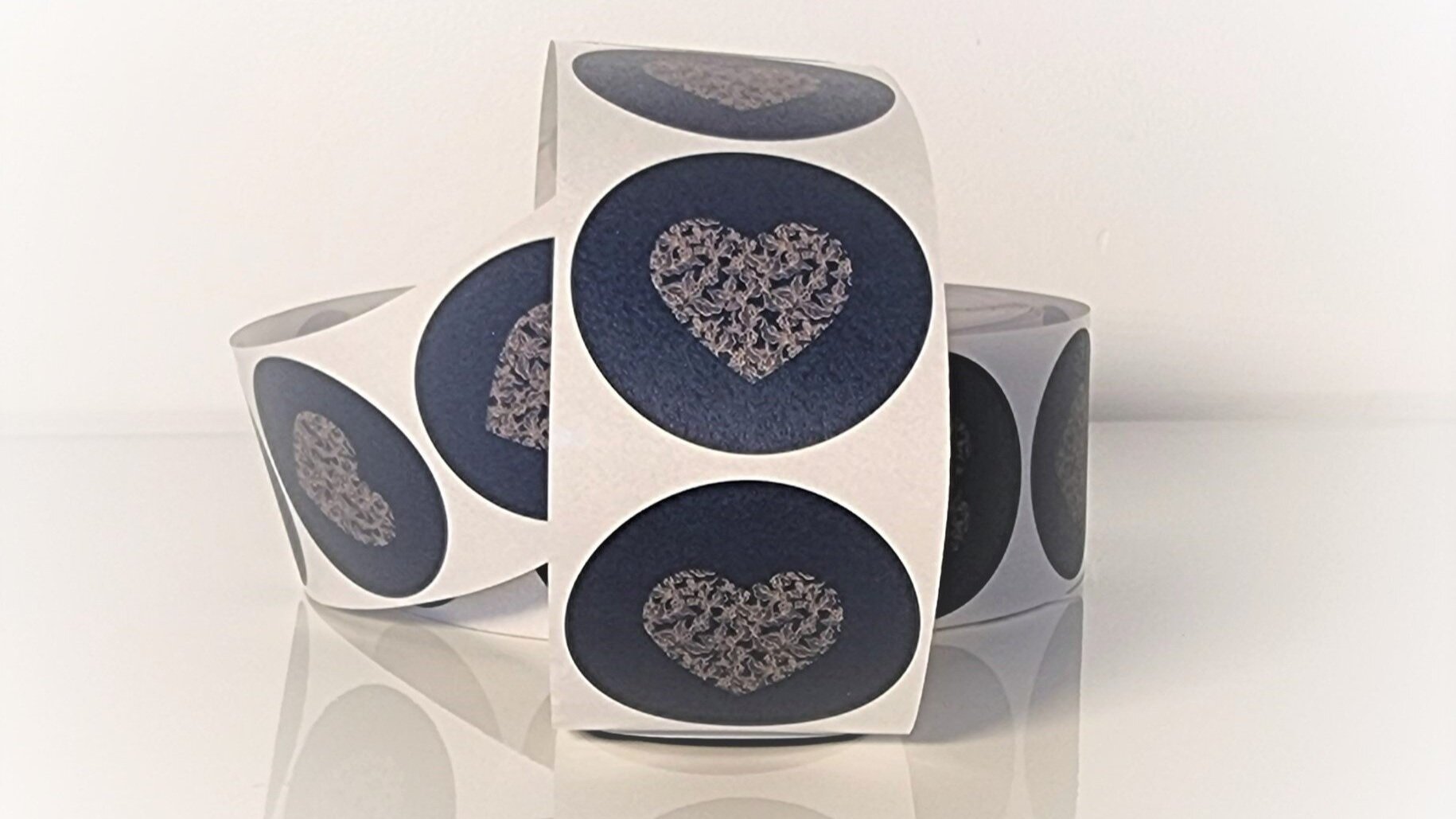
If you are going for a natural look and are concerned that the label may get lost, then why not try a more unusual shaped sticker to attract attention. If you do choose a non-standard shape for your label, keep in mind that you may need a cutter just for your brand which will normally be at an additional cost.
the quality
It really doesn’t matter how wonderful your design is if the quality of the label is poor. The better the biodegradable materials are, the better the impression you will make to your customers. Don’t forget, first impressions counts, so make it the best it can be!
KISS
The quote “Keep It Simple, Stupid” is really quite apt when looking into branded labels. Simple, eye catching designs, with minimal ink usage, works perfectly when promoting your eco-friendly brand.


